
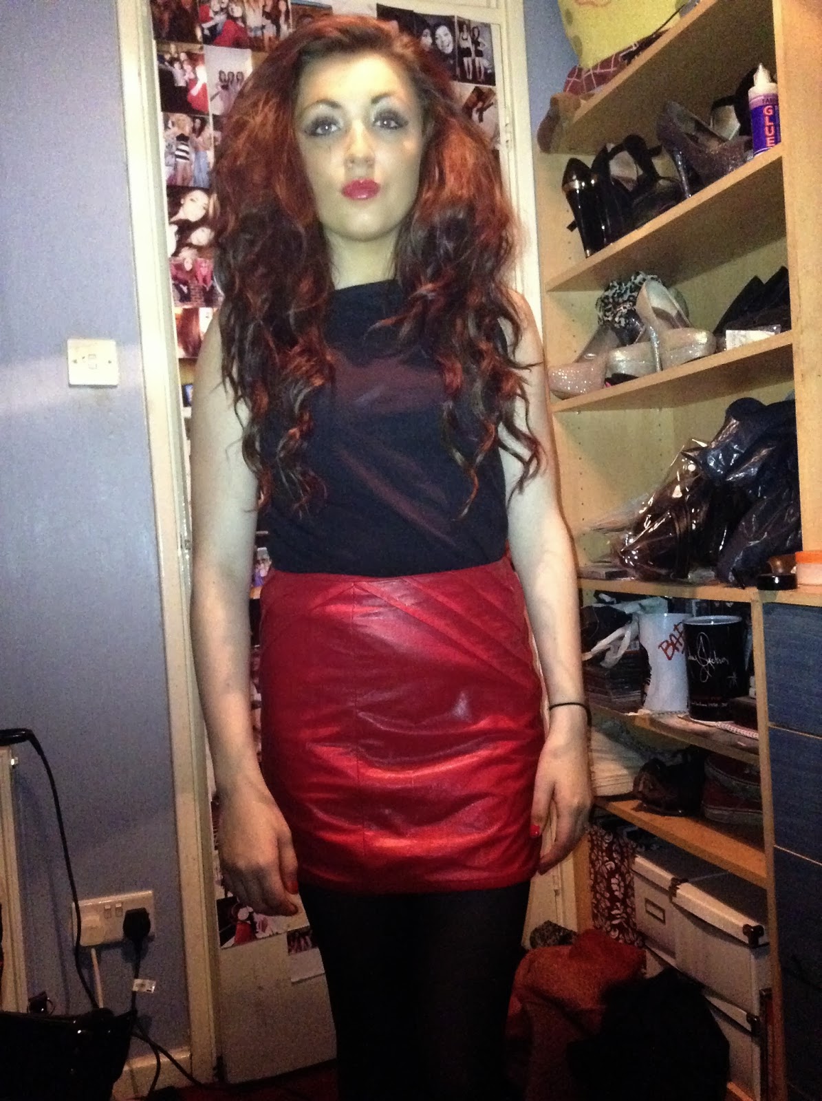
 really good as a back cover photo, but I am going to crop the bottom part of the photo off. This photo will be effective because Blossom is wearing girly clothes, but her facial expression is quite dark, conveying the rock pop genre. I am wanting to also put this photograph on a black background, because the front cover of my album is a dark grey colour, and I think that black will go best with this theme that I am going for. Back to the Avril back cover, the track songs are down the left hand side of the cover. I really like this layout because the audience are able to see Avril and the track songs. The font of the track songs are all the same font in white, but it is quite a scruffy font, like type writers, connoting the scruffy rock look. At both the bottom and right hand side of the album cover are the institutions, which in this case is Sony Music. It is important for these to be on the back of my album cover in order for it to look professional and realistic, creating verisimilitude. The bar code is also at the bottom right hand side of the cover, again this needs to be include to create the look of it being realistic.
Onto the P!nk back album cover, this has a different layout to Avril's cover, but it is still effective and eye catching. The back cover photograph is of P!nk herself sat in almost a little dress tutu. This is related to the title of the album 'Funhouse', as she is representing herself as a fairy or ballerina, which for an adult to do, is quite childish and 'fun'. The track lists of this album are placed right in the centre of the back cover, making it the first place for the audience to look. The fonts of these are all different, in fun, clown type of writing, again this is relating to the album name Funhouse. This has given me an idea for my back cover fonts, to relate it to my song title. As the song title is 'Still into You', I could use different types of font to represent the theme of love in the song, for example using little hearts around the song tracks. But, not forgetting that my artist is from the pop rock genre, I need to not make it so girly, and keep the grungy look conveying throughout my album. On the left hand side are all of the institutions. Again, P!nk is from the Sony Music corporation, and that is labelled on the bottom right hand side of her album cover. On her album, unlike Avril's, it includes on the back of the album the executive producers of the album and of her songs. This looks very professional and realistic. The bar code on this album is placed at the top left of the album back cover.
The last album back cover that I looked at was Florence and the Machines album 'Ceremonials'. I chose to look at this album back cover because the band shares the same genre as what my artist does. This back album cover has no picture, yet it is still effective. Instead of using a picture, they have used the title of their album spread across the back. The track lists of the album are placed in the center of the back cover, and is in very basic black font. This is effective because it is not giving too much away of the album, and could make people wonder what it is like, therefore making them have an urge to buy it. The font is all the same, but it does look a little but dull and plain, as it doesn't really give the audience much to look at. The institutions of this album are in very small print at the bottom of the back cover, unlike P!nk and Avril's. The barcode of the album is placed at the bottom right.
From looking at these album back covers, I am going to design two of them, one being with a picture of Blossom on, and one being without, like Florence and the Machine's back cover. From doing this, I will be able to decide which one I think is most effective and what changes I need to make.
No comments:
Post a Comment